
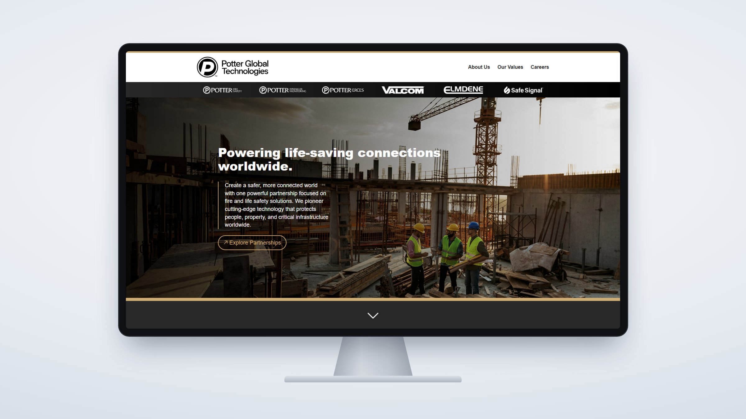
A new name for a company its customers already trusted
- Role
- Brand strategy, identity, voice, and guidelines, then ongoing governance
- Scale
- 1,000-employee company, six brands, two ownership transitions
The Problem:
Private equity had acquired Potter, and the new brand had two jobs. Abroad, Potter was known as reliable but budget, just as the company was entering those markets with a far more complete, higher-end line. At home, a growing portfolio of acquired companies needed a parent brand.
How I think about itA rebrand has to be decided by what the brand needs to do, market by market, before anyone draws a mark.

The Potter name carried two reputations. In North America and Western markets it stood for the highest quality, the best support, and the longest track record in the category, equity the new identity could not afford to spend. In price-sensitive international markets, where Potter sold simplified versions of its domestic products, the same name read as a budget brand. The rebrand had to protect the first reputation and replace the second.
I led the brand from strategy through delivery: the research with executive leadership and customers that defined what the brand needed to say in each market, the identity itself, the voice, and the guidelines that govern how every division applies it. Decisions were made against clear goals and presented as options, so every choice could be judged on what it did for the brand.

Potter Global Technologies now acts as the parent brand for a portfolio of six companies. Three were brought under the Potter name: Potter Fire Safety, Potter Sprinkler Monitoring, and Potter ERCES, formerly TowerIQ. Three kept the identities their customers knew: Valcom, Elmdene, and Safe Signal. I set the rules for both paths and have governed the system through two ownership transitions and multiple acquisitions.
The internal rebrand mattered as much as the external one. Town halls, executive video, and the new owner’s corporate materials recast in Potter’s voice gave employees a company they recognized while the name on the door changed.
The decisions behind the logo
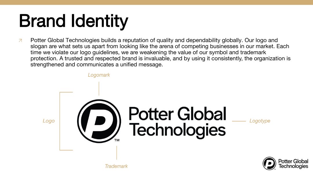
- A familiar markIt plays off the Symbol of Protection, the circle mark on Potter’s core brands that customers had trusted for decades. The new company arrived looking related, not replaced.
- Visual momentumThe P leans into its stroke to read as forward movement and momentum, which is what a new owner and a new market strategy needed the brand to say.
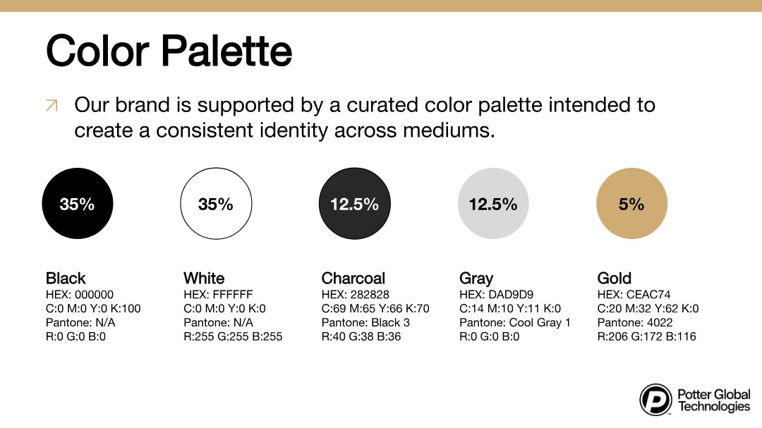
- Complementary designBlack, white, and gray sit comfortably beside the reds and blues of the core brand identities instead of competing with them. Gold carries value, prestige, and quality in almost every market, which mattered abroad.
- Flexible typographyA plain, confident face that plays well alongside a variety of brand guidelines, so the parent brand can appear next to any company in the family without a clash.
The guidelines
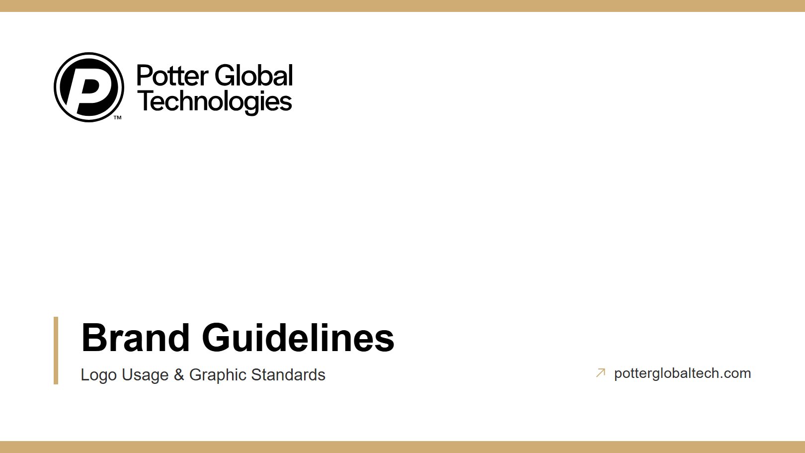
A 27-page standard covering the logo, business unit lockups, color, type, graphical elements, and photography, written so every division and acquired company could apply the brand without the creative team in the room.

The Results
- Validated by customersdirect feedback at trade shows, the annual conference, and the customer advisory council
- International sales acceleratedimmediately following the rebrand and new market strategy
- One identity, six companiesgoverned through two ownership changes
